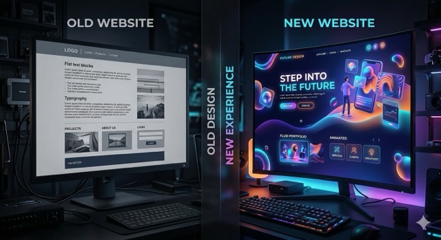


A £4m consultancy can lose a six-figure opportunity without seeing a single warning in its CRM. A referred buyer opens the website, finds vague positioning, old case studies and a clumsy mobile experience—the failures a B2B website redesign must correct—then removes the firm from the shortlist.
These are outdated B2B website signs. They are not aesthetic offences. They are points where the website creates more uncertainty than a time-poor buyer is willing to resolve.
A commercially outdated site can look polished. The real issue is a mismatch between what the company now sells, what buyers need to verify and what the website communicates. If several of the following symptoms appear together, use the broader criteria for what B2B companies need to get right in a conversion-focused redesign to assess the scale of the problem.
Outdated B2B website signs buyers notice first
1. Your offer takes more than ten seconds to understand
Read the homepage without relying on what you already know about the company. Can a buyer identify:
- What you sell
- Who it is for
- Which business problem it addresses
- Why your approach is credible
“Transforming businesses through innovative solutions” answers none of those questions.
This ambiguity is particularly costly with referrals. A recommendation creates interest, but the website still has to confirm that the company is relevant. If it cannot, the buyer may assume the referrer misunderstood its requirements.
The revenue symptom is a high proportion of sales calls spent explaining basic positioning. Another is inbound enquiries from companies that are plainly the wrong size, sector or use case. That does not necessarily mean marketing is attracting the wrong people; the website may be failing to filter them.
2. Your proof is old, anonymous or impossible to evaluate
A logo wall is not proof of an outcome. Neither is a quotation saying the team was “great to work with”.
Inspect the evidence supporting each major service. Warning signs include case studies that pre-date the current offer, anonymous testimonials, results without a starting point and client logos with no explanation of the work completed.
A buyer does not need dozens of case studies. They need enough specific evidence to answer: “Has this company solved a comparable problem, under comparable constraints?”
If the latest relevant example is three years old, buyers may assume the capability has weakened, the team has changed or the service is no longer a priority. Those assumptions may be wrong, but uncertainty still enters the deal.
3. The mobile experience looks like an afterthought
B2B buying does not happen entirely at a desk. Links are opened from email, Slack and LinkedIn on phones, particularly when a colleague forwards a supplier for a quick opinion.
Check whether cookie banners obscure key content, forms require excessive typing, comparison tables disappear off-screen and buttons are easy to select. Test on an ordinary mobile connection, not only office Wi-Fi.
The commercial loss is rarely recorded as a “mobile problem”. The buyer simply does not return, forward the page or complete the form. This makes poor mobile execution easy to underestimate.
Outdated B2B website signs that weaken evaluation
4. The website describes the company you were two years ago
Growing B2B firms change faster than their websites. They move upmarket, specialise, introduce new services or stop taking low-value work. The old positioning often survives in page titles, navigation labels and calls to action.
Compare the website with the last ten proposals sent by sales. If proposals lead with a different offer, audience or point of difference, the website is no longer the source of truth.
Also distinguish dated messaging from bland messaging. Accurate copy can still make the company indistinguishable from five competitors. Developing a credible B2B brand personality is relevant when the facts are current but the language carries no recognisable point of view.
The revenue impact appears as mismatched leads, repeated expectation-setting and prospects questioning capabilities that sales considers established.
5. The site only persuades one member of the buying committee
A marketing lead might care about campaign speed and lead quality. Finance may want commercial clarity. IT may examine integration and security. Procurement will look for risk, process and contractual confidence.
If every page repeats the same high-level promise, your internal champion has little material to circulate. They must create the business case themselves.
Review a recent complex deal and list the people who influenced it. Then identify what each person could verify independently on the website. Missing information does not need its own page in every case, but it should be findable and specific.
The revenue symptom is a deal that progresses well with one contact and then stalls when additional stakeholders enter. No form submission will identify the website’s role in that delay.
6. Navigation mirrors your organisation chart
Buyers do not necessarily understand the distinctions between your practices, divisions and internally named methodologies. They arrive with a problem, a desired outcome or a service category already in mind.
A navigation structure built around internal departments forces them to translate their need into your terminology. Duplicate service pages, unexplained acronyms and vague labels such as “Solutions” make that translation harder.
Choose three high-value buyer intents and attempt to reach the most relevant proof from the homepage. If each route requires several guesses or leads to pages repeating the same generic claims, the structure is obstructing evaluation.
The result is not merely lower engagement. It can make a capable specialist appear less relevant than a weaker competitor whose expertise is easier to verify.
Deal-costing signs in conversion and demand capture
7. Every journey ends with “Contact us”
A direct conversation is appropriate for a buyer with a defined requirement. It is a large commitment for someone still comparing approaches, checking fit or building an internal case.
Look for useful next steps between reading and speaking: a relevant case study, a detailed service explanation, an implementation outline, an assessment or a way to request a specific deliverable. The objective is not to add downloadable PDFs everywhere. It is to match the next action to the buyer’s level of intent.
When “Contact us” is the only route forward, interested buyers either leave or submit vague enquiries. Sales then receives fewer conversations and less context for the ones that arrive.
8. Paid traffic lands on a generic page
Google Ads makes this problem expensive quickly. If an advert promises one outcome but sends visitors to a broad homepage, each buyer must reconstruct the connection between their search and your offer.
Consider a B2B software company buying 1,500 visits per month at an average £7 per click. Its monthly media cost is £10,500.
Suppose 600 visitors from high-intent campaigns land on the homepage. A tightly matched service page produces qualified enquiries from 3.5% of comparable visitors, while the homepage produces 1.2%.
The difference is:
600 × (3.5% − 1.2%) = 13.8 fewer qualified enquiries per month
If 30% of those enquiries typically become genuine opportunities, that is roughly four potential opportunities. At an average deal value of £45,000, the symptom affects about £186,000 of potential pipeline each month.
That is not guaranteed revenue, and the example is not a redesign business case. It shows why landing-page mismatch is more than a bounce-rate problem.
9. Sales avoids sending prospects to the website
This is often the clearest warning sign because it sits closest to live deals.
Ask sales which links they send after an initial call. If representatives rely on bespoke decks, old PDFs or lengthy emails—and warn prospects that parts of the site are out of date—the website is not supporting the sales process.
Compare the claims, examples and terminology in current sales collateral with the relevant web pages. We see this in audits where the strongest evidence exists in individual slide decks but never reaches the public site.
The cost is duplicated work and inconsistent persuasion. Each salesperson has to rebuild trust manually, while buyers outside an active sales conversation receive the weaker version of the story.
If this analysis exposes wider gaps in your site, we can turn the evidence into a focused redesign brief — book a call
How to diagnose the commercial damage in 60 minutes
Do not begin by debating colours or whether the design “feels modern”. Use a short evidence check:
- Select three recent wins, three stalled opportunities and three poor-fit enquiries.
- Identify the pages each buyer would probably have encountered from search, advertising or referral.
- Repeat those journeys on desktop and mobile without using internal knowledge.
- Record unclear claims, missing evidence, factual contradictions, dead ends and form friction.
- Compare the findings with current proposals and sales collateral.
Then assess scope. A broken form or obsolete case study can be repaired directly. Problems spanning positioning, templates, content structure and technology are closer to full website design and redesign work. A campaign page or contained group of improvements may fit a focused website project instead.
Avoid responding with disconnected button and headline changes. If the underlying proposition and evidence are sound but particular journeys underperform, that belongs in a structured B2B conversion optimisation programme, not a cosmetic rescue exercise.
FAQ
Does an old-looking website automatically cost deals?
No. Visual age is a weak diagnosis on its own. A visually conservative website can still communicate clearly, prove its claims and support evaluation. A fashionable site can fail all three. Prioritise commercial clarity, credible evidence and usable journeys over design trends.
What is the strongest sign that a B2B website is outdated?
Sales reluctance is especially revealing. If experienced representatives do not trust the site to support a live opportunity, ask what they send instead. Their replacement material usually exposes the missing proof, outdated positioning or unclear service structure.
Do several warning signs mean we need an immediate redesign?
Not automatically. Fix critical errors first, then determine whether the failures are isolated or systemic. Before committing significant budget, use a disciplined method for modelling website redesign ROI against realistic commercial assumptions.
How often should these signs be checked?
Run a light review after any material change to your offer, target market, brand or acquisition strategy. Otherwise, a quarterly check of key journeys and an annual content review are sensible. High-spend campaign landing pages deserve more frequent inspection.
Summary
- Commercial age matters more than visual age.
- Vague positioning and weak proof remove firms from shortlists silently.
- Buying committees need evidence they can circulate internally.
- Generic landing pages turn paid traffic into avoidable pipeline loss.
- Sales avoiding the website is a serious warning.
- Diagnose whether failures are isolated or site-wide before choosing the remedy.
Actualyse designs and rebuilds B2B websites that turn research visits into qualified pipeline. Book a call to talk through where yours stands.